I have designed both the UX logic and UI visuals on a number of game, app, and web projects. I am very enthused by the idea of making complex, or potentially confusing systems, as simple and elegant as possible. Being competent at both the logical design phase and the visual styling phase allows me to be highly results-orientated as I can see the big picture of how the two areas overlap.
Skills
Tools such as Adobe XD, Balsamiq and UXpin
Adobe Photoshop, Illustrator & After Effects
Painting treatment (Procreate or Photoshop)
Building Widget Blueprint layouts in Unreal Engine
Assisting programmers with UI Blueprint logic in Unreal Engine
UX research
Information architecture
Sketches and wireframes
Interactive prototype
User testing
Visual moodboarding
Visuals and animation
Implementation
More testing & iteration if necessary
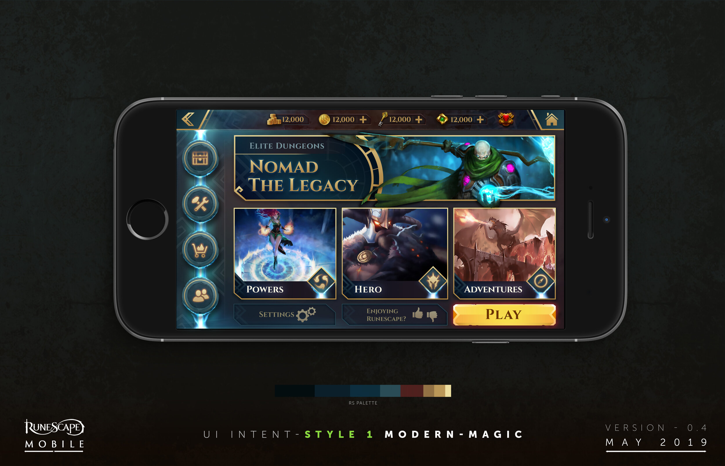
Runescape is one of the most popular F2P MMO’s in the world, having built up a global audience of millions of players over many years. In November 2018 ‘Runescape Old School’ launched on mobile devices and debuted at No1 in the US app stores. Runescape 3 is also currently in closed-beta on mobile as well as fully playable on PC.
My company, Sixth Realm, engaged on a contract with Jagex to help the internal Live-Ops department update the game’s UI. This involves the rollout of new features and incorporating a new visual style into the UI.
My deliveries included…
• Consultancy services
• Wireframes
• UX interactive prototypes
• UI art
• Exported assets ready for integration
I worked on many projects and features. Here I will show a few case studies of work that has gone live, and I am also pleased to say, proved a successful addition to the game!
VISUAL TARGET
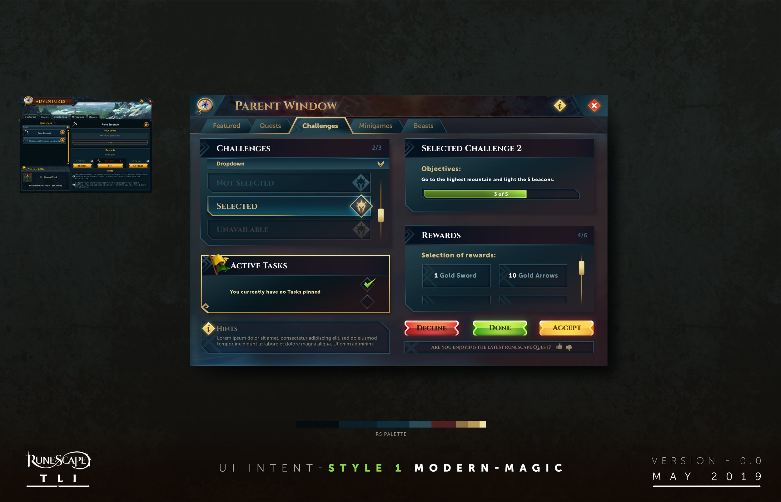
We (Stuart Murray, Giles Wood & Myself) developed a ‘visual target’ benchmark for different aspects of new Runescape UI, which later evolved into a style guide. This now guides the development process and ensures new work is produced in a consistent style.
YAK TRACK
The inaugural ‘Yak Track’ feature in Runescape was a seasonal promotion as part of the game’s ‘living’ ethos. Players can undertake a series of tasks in order to level up in particular areas, as well as win new rewards and prizes. A number of these prizes are exclusive to the Yak Track promotion: thus driving monetisation and retention.
RING OF SHARDS
Ring of Shards is one of a number of promotions I have worked on for the game’s Treasure Hunter feature. The goal is to change the existing formula slightly to provide something new, as well as modernise player onboarding.
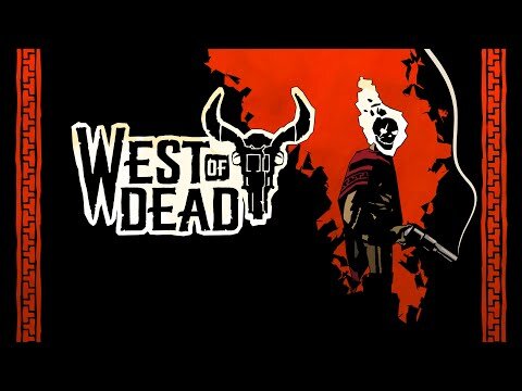
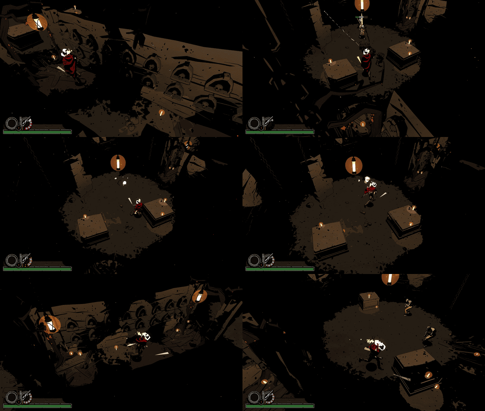
In 2018, as part of my job working for Daedalus Partners, I was contracted to provide some design consultancy to a new game in production called West Of Dead. As part of the project I had to take the design of the game and work on a suitable UI treatment.
My role was less focused on purist UX methodology in this case, as Upstream Arcade wanted to strictly follow the functionality laid down in another game. Therefore their key goal in the short-term was to try and establish how UI could be built out of a set of art components (in-engine) by them internally, as the design of the project flexed.
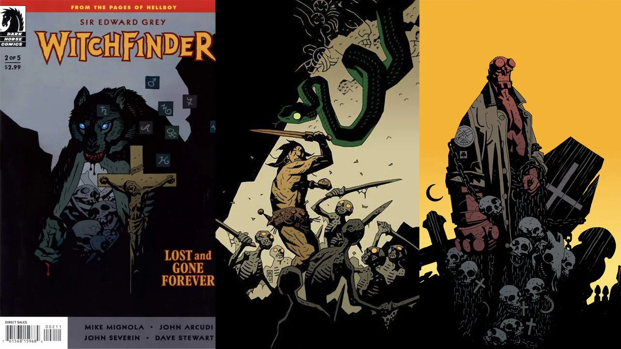
The team at Upstream Arcade successfully developed a graphical/rendering style for the game based upon the comic books of Mike Mignola (Hellboy creator).
It was very important to them to stay faithful to the style and vision of Mignola's art in order to provide the right appeal, whilst retaining the flexibility of a true 3D camera, environment and animation.
Inherent in this style, is the notion of a limited colour palette and black being the predominant colour on-screen.
It was one of my jobs to then interpret this style throughout the UI, working with Upstream Arcade and listening to their feedback, it was important to draw on the native American and gothic horror themes in order to pre-visualise results that were complimentary to the game.
West Of Dead is signed for publishing by Raw Fury.
The key strategic goal of the project was to make a game that looked like the artwork of Mike Mignola come to life!
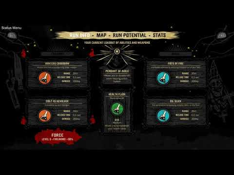
I started by working on the game HUD, so that the game was playable and presentable. My starting point with this was sketching out and brainstorming different ideas, given the data that needed to be shown.
One of Upstream Arcade’s key requirements was for me to build up a library of illustrated components so that they could then build the UI in-engine as the game developed.
I then went over the style of the UI components in order to bring them as close as possible to the style of Mike Mignola.
Once I had made the UI components I then proved they worked by putting together a number of screens.
I knew some screens would benefit from ambiance when the game was paused, so I created pre-vis that would suit the tone of the game and support the UI.
A (non-exhaustive) selection of the UI screens I designed for Underzone using Balsamiq, Photoshop, Illustrator and After Effects. UI was then laid out in the Unity UI canvas system, while all data and gametext was hooked into an XML based database that can be edited/exported with a custom-engineered Excel plugin.
Designing the UI for Underzone was really part of a more holistic, and invisible, design process that required marrying up the ludonarrative context with the players progression through the game. As the only designer on the project, creating the industrial-futurist look for the UI was really only part of the challenge. The main challenge was the UX itself: to lead the player through a lot of unknowns (not least, caused by using procedural generation in a 'different' way) in the simplest approach possible, whilst reinforcing everything around the games core value propositions: procedurally generated enemies, a large scale rescue mission, a conspiratorial narrative in an underground labyrinth, ect.
All of this required user/play testing which I conducted with a sample of 120 people in August 2017. I then made alterations necessary for an improved user experience.
The player starts the game here, so it was important to place them within the context of their overarching goals, which remain consistent despite the game changing in a procedural way from run to run.
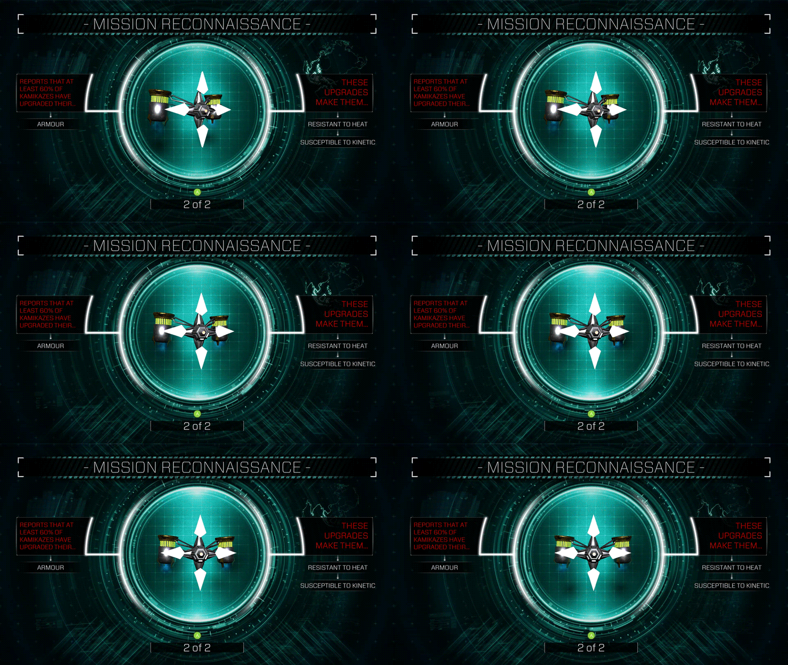
This was is a crucial piece of UI that occurs when moving between game worlds, because as the player does the enemies in the game upgrade themselves in a procedural, unpredictable, way. Therefore the reconnaissance allows the player to begin to strategise and/or plan tactics to deal with what is coming.
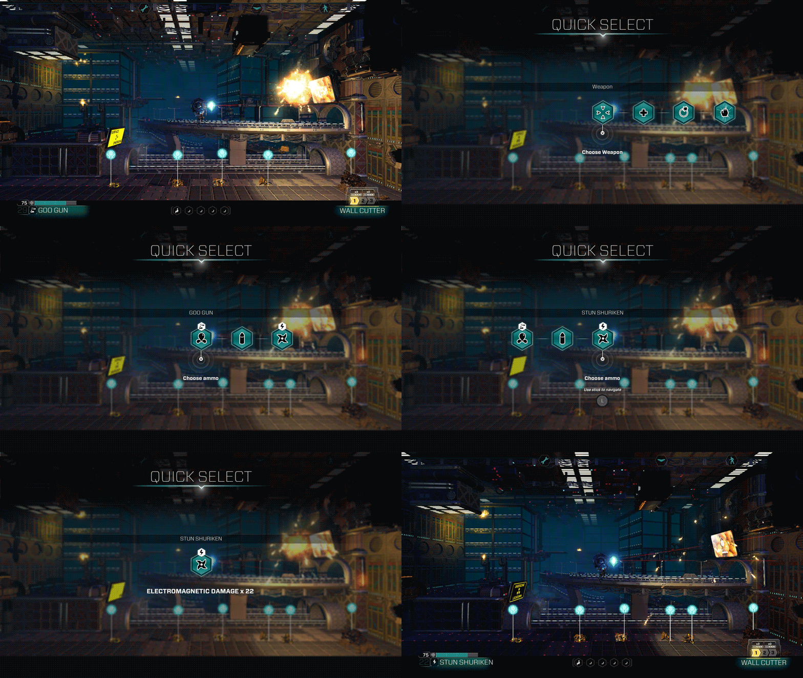
Allows player to select things in-game.
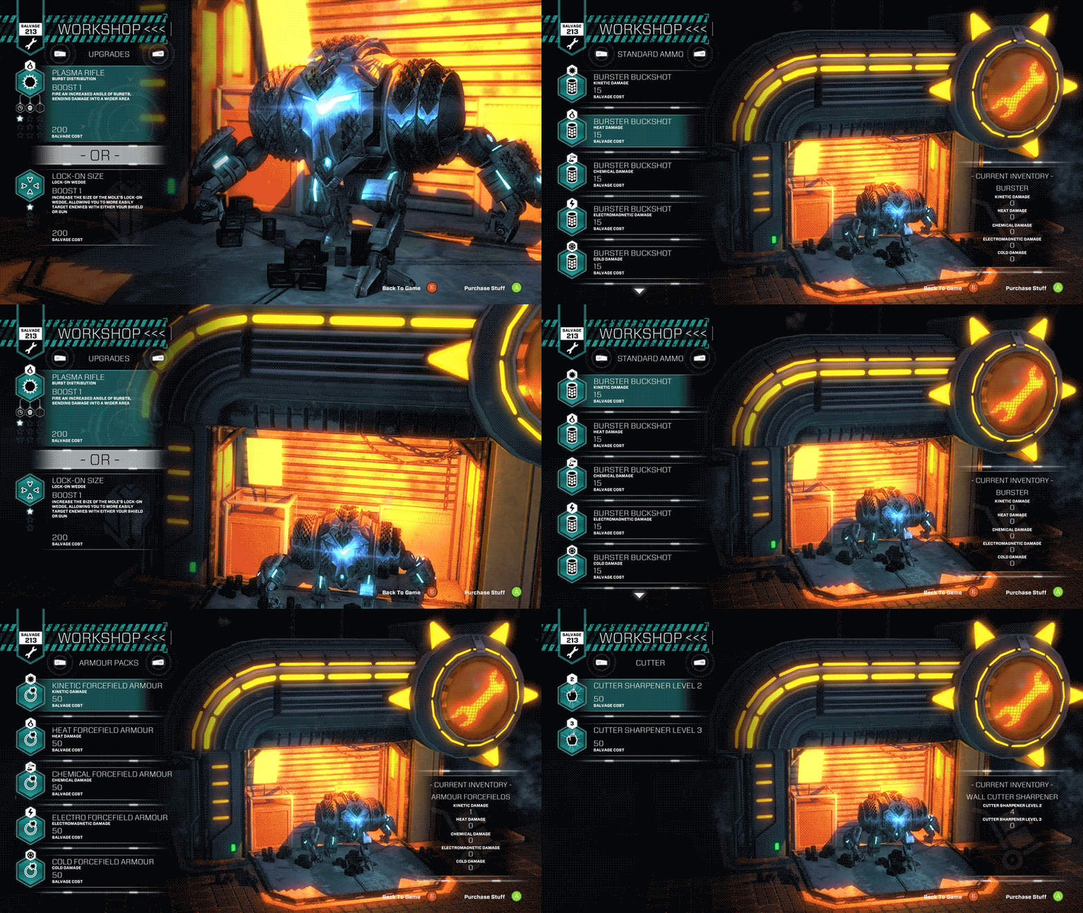
The player can upgrade or buy more resources in-run here.
One of the core challenges here was to bring in themes of industrial futurism but also developing a HUD that can actually be used by the player: the majority of sci-fi interfaces in movies look cool on screen but couldn't actually be used in reality.
The player can check this at any time in game to review critical information.
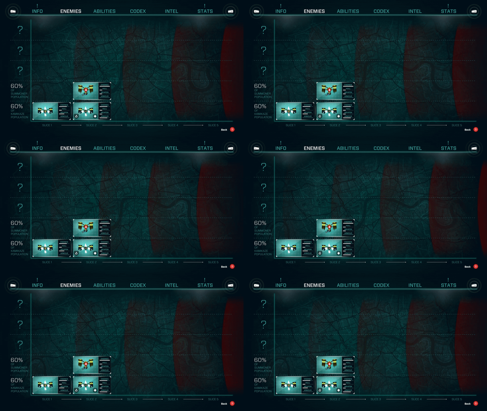
This is one of the most important pieces of UI in the game. As the player progresses through the game new enemy archetypes get introduced and as they do these 'top trumps' style cards get placed on the graph, showing how the majority of the baddie population have leveled up. The map of London can be seen underneath the graph to infer how the player is moving across the city as part of 'Operation Slice-Sweeper'.
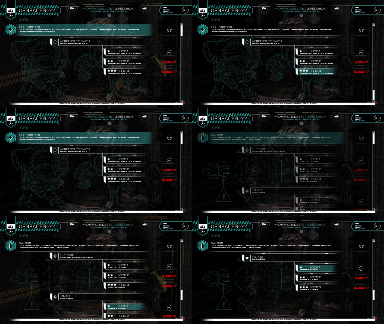
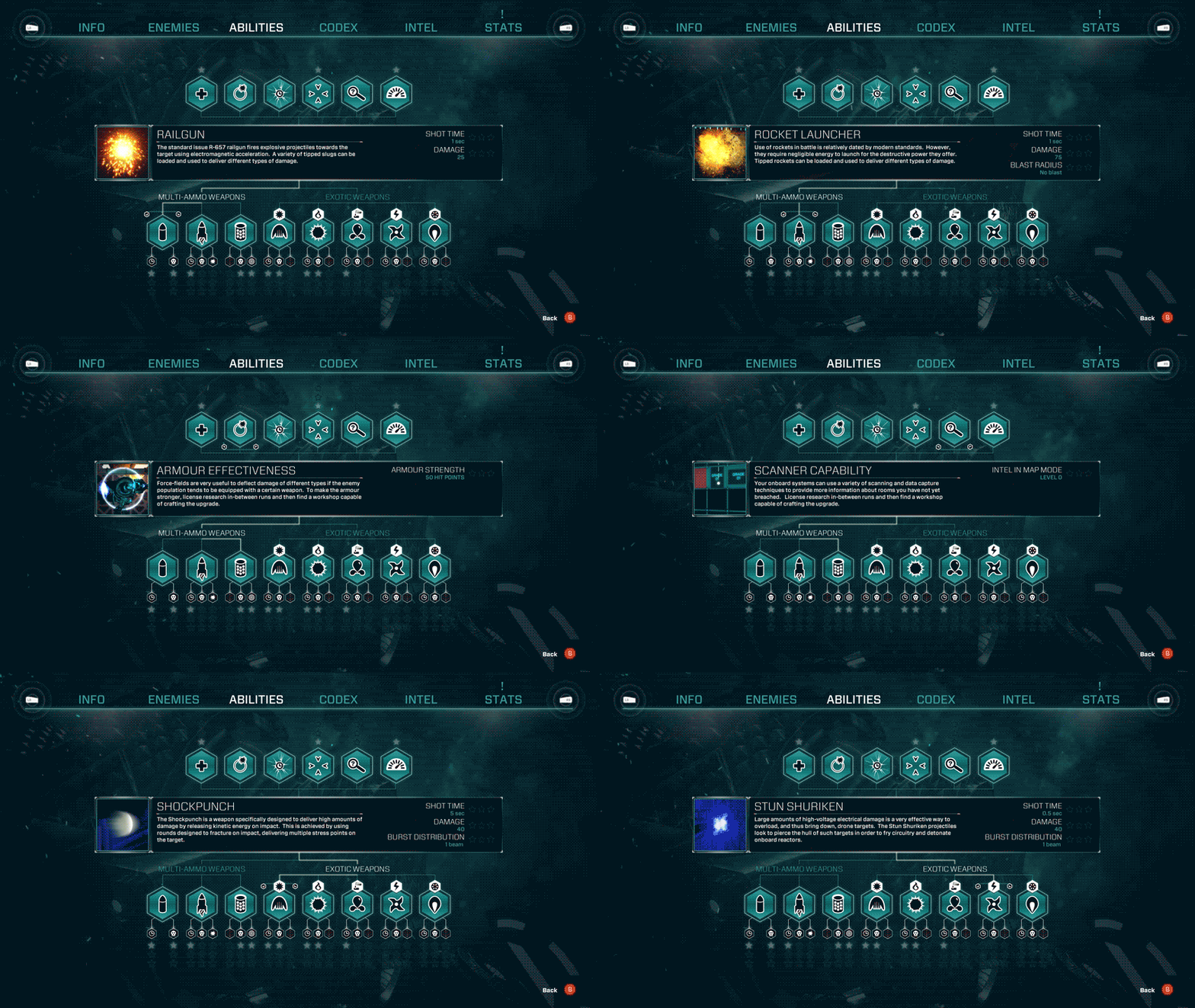
The player's mole mech has a variety of upgrades that can be unlocked and fitted from run to run. They can view their capabilities at any time here.
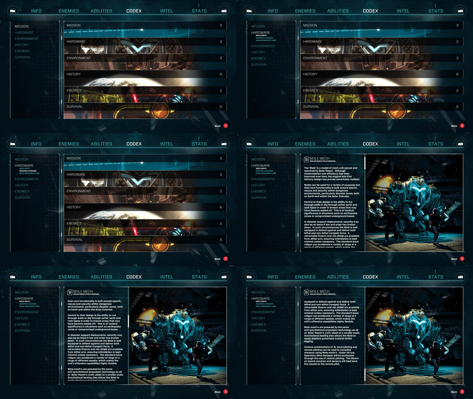
The game has a full codex that the player can access to get further information and help about both the gameplay and the game lore/world.
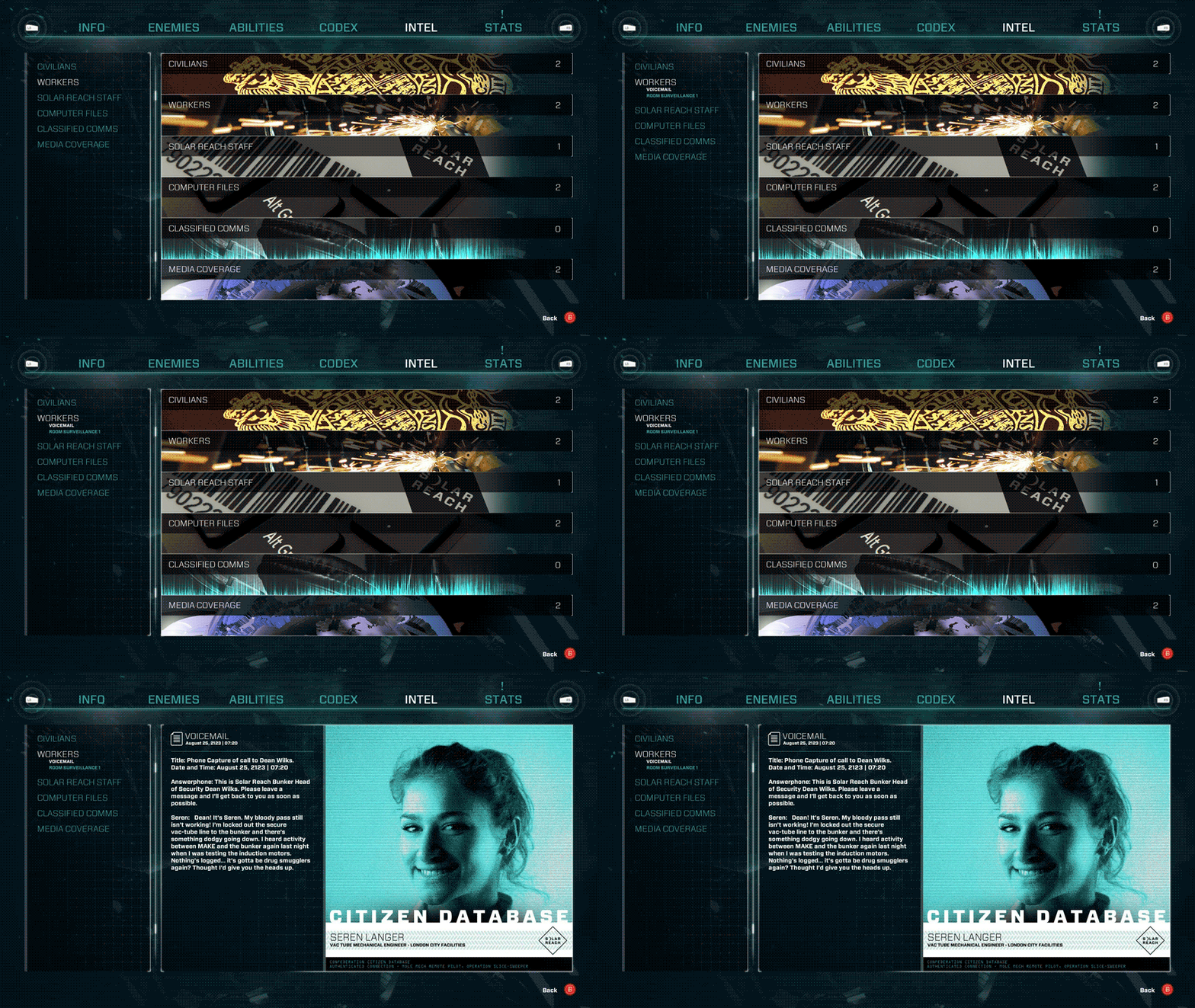
As the player moves through the underground labyrinth of the Underzone, they 'data capture' different pieces of 'intel' based upon their current rank and security clearance. This allows them to gradually piece together a conspiratorial narrative in a non-linear way.
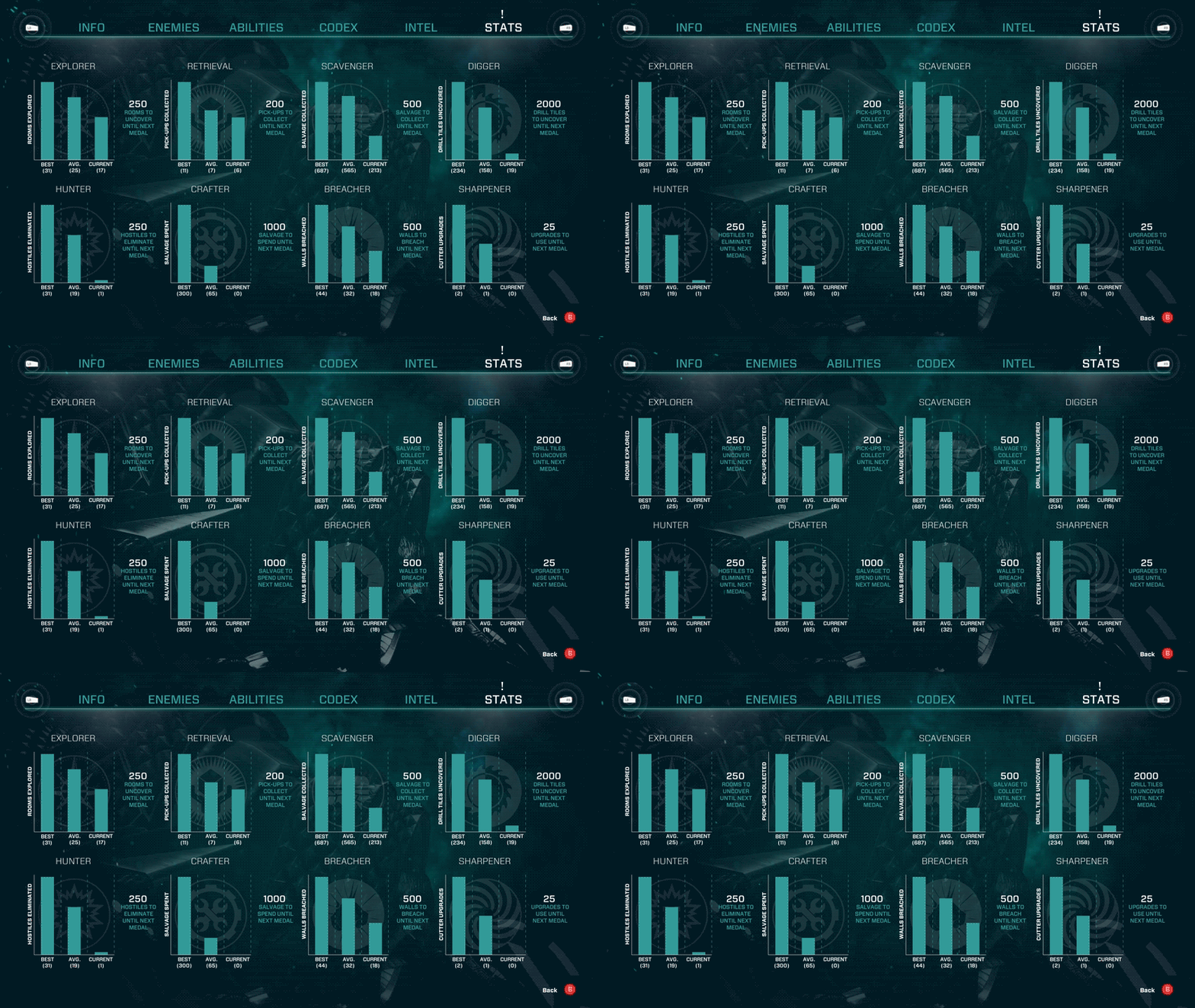
The player receives medals for pumping up stats along particular vectors. They can view those here along with how far they are off the next medal.
The player is rewarded with XP in runs for successful rescues of human survivors. They can then spend this XP back in the hangar, inbetween runs, on licenses that improve the pool of potential upgrades on the players next run.
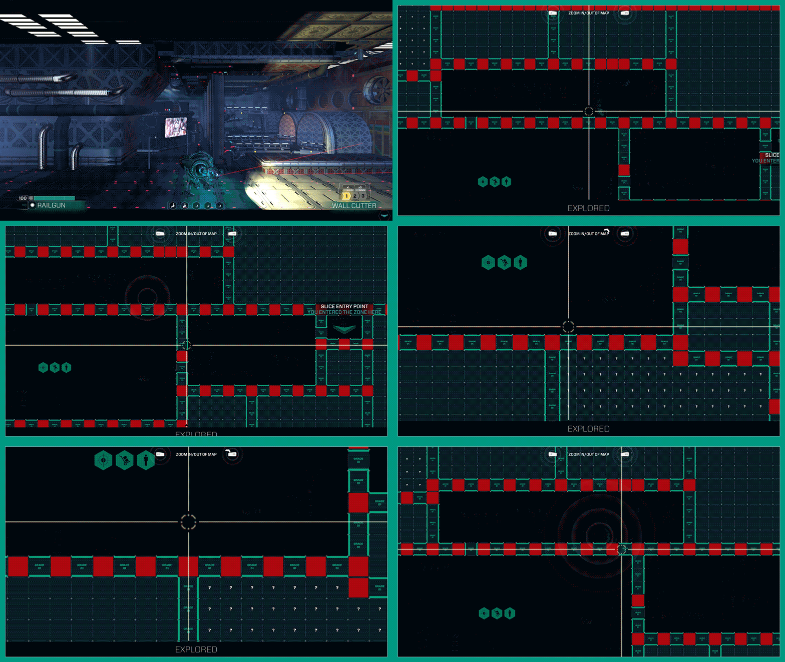
From a very early stage in the project we knew the game would be a tile-based world as it solved a lot of problems with breaching from room-to-room. Therefore the design of the in-game map was something I nailed down fairly early on. Conceptually, I based it off the schematic map that can be seen in the movie Aliens (1986), and was happy that this retro-futurist approach seemed to work in the game rather well.
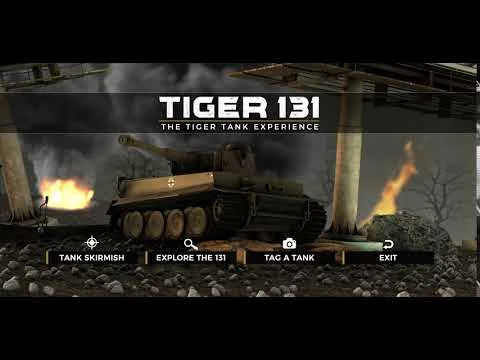
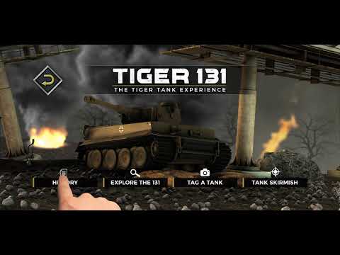
The Tiger 131 commemorative collectible medal is made and sold by The Koin Club. The Tiger 131 is a German WWII tank, and the only fully functional one of its kind left in the world. It is seen among military historians as a landmark feat in engineering for its time. When a player uses the complementary AR app to 'scan' the medal, extra features bring the tank to life.
When I was asked to join the project the initial feature set was already laid down and implemented to a pre-alpha state. I was asked to design the UX/UI treatment as well as the promotional video material in order to maximize the look and feel of the experience.
I on-boarded the project late into development, where changes to the UI were urgently needed: primarily from an aesthetic perspective but also from a functional one too. This was a final information architecture that I provided to the programmers using every screen, so that there was no uncertainty around what the app was supposed to do.
The first task I had was to design a dashboard style wrapper from which the Tiger 131 Experience, and future experiences, could be downloaded, managed and launched from.
I created a seamlessly looping title screen background that was pre-rendered. The UI layer then sits on top.
The entire feature set of the AR experience then needed designing and skinning. The main challenge was finding a look that was clean, simple, suited the WWII theme and most importantly, was conducive to the different supported resolutions/aspect-ratio's across mobile devices. To do this I essentially took the approach of designing everything to sit within a critical resolution in the middle: allowing larger resolutions to show more of the frame and smaller resolutions to allow non-critical stuff to be cropped out.
UI Animatic: So the programmers could get a feel for the final vision intended for the UI.